The outdoor area, ground floor and basement of Winthontlaan 1 will undergo a metamorphosis. This includes a new appealing and recognizable corporte identity. Become inspired!
Winthontlaan 1 is an attractive and dynamic place to work, meet people and relax. W1 is easy to find and there is a lot going on. It's all about connecting. With the surroundings, the building and each other. Both inside and outside, you experience a warm, natural atmosphere. Green, health and sustainability are spot-on in the new corporte identity.
The logo
Winthontlaan 1 is the first building on the street. The starting point, the central focus, the place to be. For this reason, the logo embodies the name of the street. The logo consists of the W and the 1 and is made up of arrows. You are there! Bright, clear and dynamic. This is where you meet, where you come together.
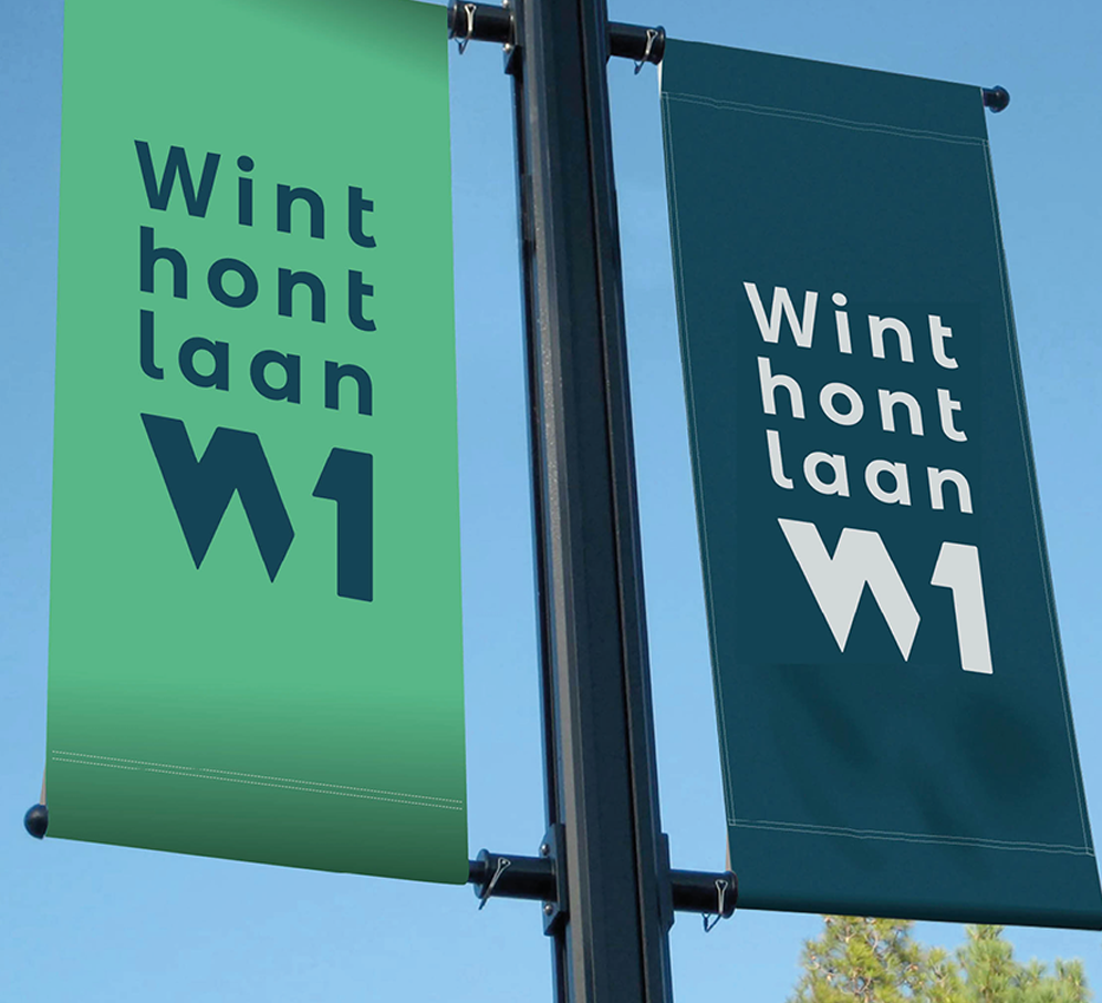
The colours
The colours are clear, corporate and atmospheric at the same time. The main colours are blue, green and silver-grey. The other colours are signal colours, drawing attention and showing the way. The two shades of blue refer to water and air and stand for trust. The green refers to nature, healthy and sustainable. Red implies action, energy and ambition.
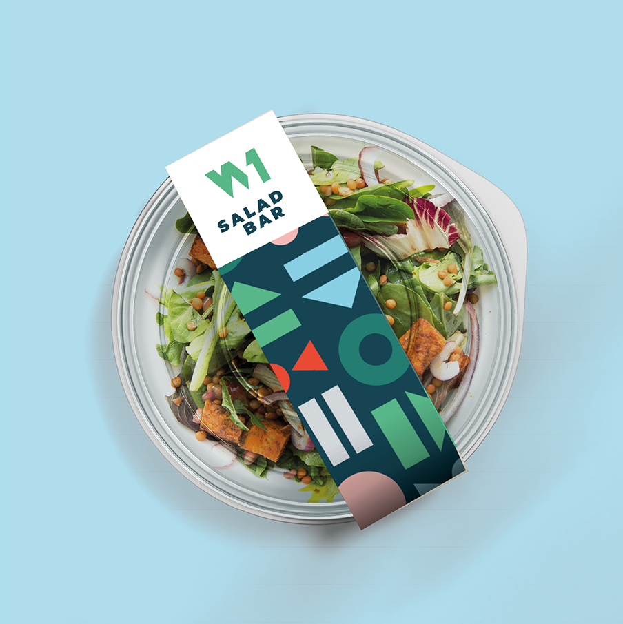
Graphic elements & photography
The graphic elements and photography give W1 a face and stand for the diversity inside the building. The images are vibrant and communicate action. They mainly show people using the facilities in and around the building.
Applications
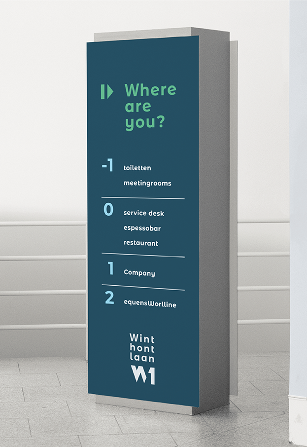
The corporte identity appears in various elements. On the signing outside, on and inside the building, on the website and social media, and in the interior and for example on coffee mugs.